You visit your favorite restaurant, and at some point, you may need to use the restroom. You know exactly where it is, so you head over, take care of business, and return to your meal.
Simple. Uncomplicated. Effortless.
But that’s not everyone’s experience.
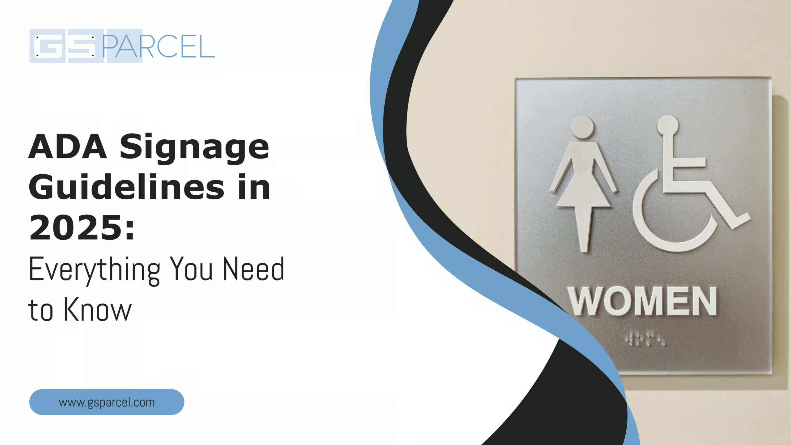
On your way to the restroom, you might pass signs mounted on doors or walls, icons indicating male, female, or unisex facilities.
Sometimes, you’ll notice small, raised dots beneath the text or symbols. Those dots aren’t decorative; they’re Braille, and they play a vital role for people who are blind or have low vision.
While you rely on sight to navigate the space, someone else might read that information through touch. These subtle details, easy to overlook but essential for accessibility, highlight the importance of ADA signage.
The Americans with Disabilities Act (ADA) helps make spaces more accessible for everyone, including people who can’t rely on sight to find their way around. For someone with low vision or blindness, things like raised letters, Braille, clear contrast, and the proper sign placement make all the difference.
This 2025 guide is here to help you understand what thoughtful, ADA-compliant signage looks like and why it matters. Because when signs are designed right, they don’t just meet regulations; they make spaces feel open, safe, and welcoming for everyone.
ADA Signage Guidelines: What They Are and Why They Matter
The Americans with Disabilities Act (ADA) was enacted in 1990 to prohibit disability-based discrimination. It has several sections (Titles) covering areas like employment, government services, and “public accommodations,” which include private businesses and commercial facilities open to the public. Under ADA Title III (which covers businesses) and Title II (state and local government facilities), accessible design standards must be followed for new construction and alterations. These standards, known as the ADA Standards for Accessible Design, detail how buildings (including their signage) must be designed to be usable by people with disabilities.
Why do signs matter?
Imagine a visually impaired patron trying to find a restroom or someone with low vision locating an exit. ADA-compliant signs provide tactile (touch-readable) text and Braille for those who can’t rely on sight, and they ensure that any visual text is easy to read (with adequate size, contrast, and font).
Compliance matters legally because improper signage can lead to violations of federal law (lawsuits, fines, or failed inspections).
- It also matters socially: inclusive signage shows your business is welcoming and safe for everyone.
Inaccessible signage can deny goods or services or create unequal experiences, which is exactly what the ADA prevents. In short, following ADA signage guidelines isn’t just about avoiding penalties but about equal access and good customer service.
Which Signs Must Follow ADA Signage Guidelines?
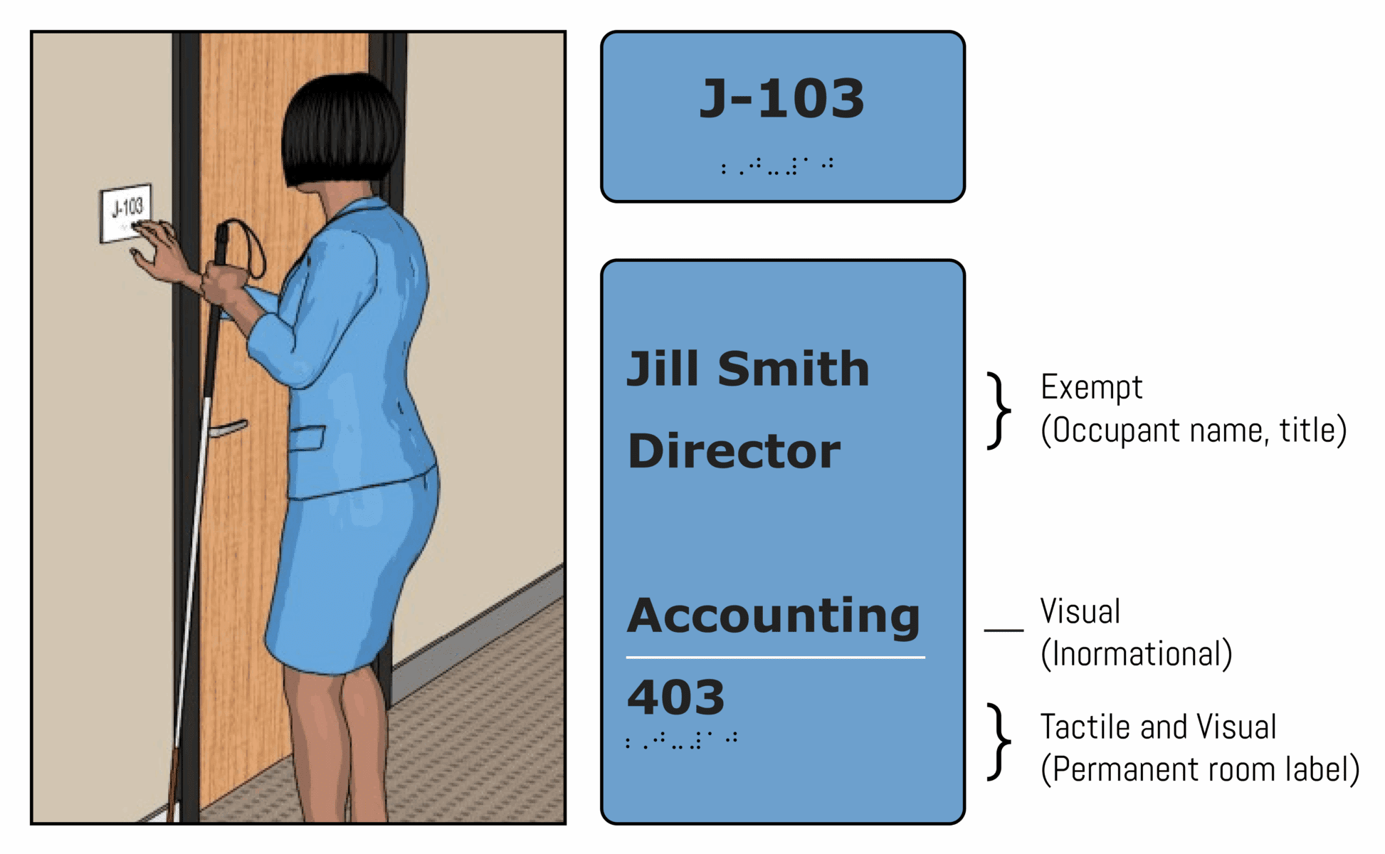
Only certain signs in a building fall under ADA guidelines, but all permanent and essential signage must follow the rules. According to Section 216 of the 2010 ADA Standards, signs identifying permanent rooms and spaces such as restrooms, room numbers, stairwells, elevators, and exits must include tactile characters and Braille.
For instance, a sign on a restroom door or an “Office 101” plaque needs to feature raised letters and Braille to meet compliance standards.
Informational and directional signs, like those pointing to a cafeteria or a temporary event, do not need tactile features. However, they must still be visually accessible, with clear fonts, sufficient contrast, and proper sizing for readability by people with low vision.
Some symbols, like the International Symbol of Accessibility (ISA), must also mark accessible features such as restrooms and exits. Even without text, these symbols must follow ADA rules for color and contrast.
ADA signage requirements apply to public and commercial facilities, including stores, offices, schools, hospitals, restaurants, and government buildings. If the public or employees use a space, its signage should be accessible.
Think of ADA signage as creating a consistent and predictable system. It ensures that anyone, including people who are blind or visually impaired, can confidently locate rooms and facilities in compliant environments.
Before we discuss the details of ADA signage, let’s explore the essentials of tactile signage, arguably the most recognizable and widely used component of ADA-compliant design.
Critical Requirements for ADA-Compliant Tactile Signage
One hallmark of ADA-compliant signs is tactile characters, letters, and numbers you can feel with your fingers. The characters must be raised from the surface to be touch-readable if a sign identifies a permanent room or space (like room names, numbers, restrooms, exits, or floor designations).
Here are the essential requirements for tactile lettering:

Tactile Characters
Characters must be raised at least 1/32 inch from the sign surface. Typically, tactile letters are engraved or molded to protrude slightly, creating a discernible texture for touch. The edges should be smooth (no sharp edges that could hurt fingers).
Capitalization
All tactile text must be uppercase (capital letters). This rule is in place because one consistent letter form is easier to recognize by touch. For instance, a room sign should use “RESTROOM” rather than “Restroom” in tactile letters. (Braille below can convey capitalization separately – we’ll discuss Braille shortly.)
Style & Font
The font for raised characters should be simple and sans-serif (or simple serif). No italic, oblique, script, or highly decorative fonts are allowed for tactile text. Unusual typefaces can be hard to decipher by touch. Stick to conventional, easy-to-read fonts with uniform strokes. For example, fonts similar to Arial, Helvetica, or other sans-serif fonts are commonly used.
The characters should also be proportionally thick, the stroke thickness of each letter should be no more than 15% of the character’s height, and the letters should not be ultra-condensed or ultra-wide.
Moreover, the ADA Standards specify that the width of the uppercase “O” should be between 55% and 110% of the height of the uppercase “I” to prevent fonts from being too narrow or too broad.
Size and Spacing
- Tactile characters have a specific size range. Generally, raised letters on signs must be between 5/8 inch and 2 inches in height (measured by the capital letter “I”).
- The 5/8” minimum ensures the letters are large enough to be easily felt. The 2” maximum prevents letters from being so large that they are hard to read by touch as a whole word. (There is an exception: if you provide separate raised text and visual text, the raised text can be as small as 1/2” , but in most cases, a single text serves both tactile and visual purposes.)
- Spacing between letters must also be sufficient. Letters should generally have at least 1/8” space between their closest points and no closer than 3/8” to any raised border around the sign. This spacing prevents letters from blending under someone’s fingertip.
Example
A compliant “FAMILY RESTROOM” sign will have:
- Raised uppercase sans-serif text (5/8”–2” tall)
- Grade 2 Braille below
- Proper spacing from borders and Braille
- High contrast, non-glare finish
Quick Tip: Most pre-made “ADA signs” meet these specs, but not all. Double-check font, letter height, and tactile depth to avoid compliance issues.
Core Physical Requirements for ADA Signage
Designing accessible signage isn’t just about choosing the right words; it’s about ensuring they are perceivable by touch and sight. For individuals who are blind or visually impaired, ADA-compliant signs provide essential tactile and Braille information that enables independent navigation.
The following sections break down these physical design elements from raised characters to Braille formatting and mounting locations so you can implement them clearly and confidently.
Braille Requirements
ADA-compliant signs must include Grade 2 Braille, a contracted form that uses symbols for common letter combinations to improve reading efficiency. This is mandatory for all signs identifying permanent rooms or spaces.
- Placement: Braille must be directly below the tactile text and grouped for multi-line signs. It should be at least 3/8” below the raised characters and away from decorative elements.
- Format: Use domed, rounded dots (not flat) manufactured to ADA-defined measurements. To avoid errors, always source Braille from certified translators or reliable sign vendors.
- Case Sensitivity: While raised text is all caps, Braille appears mostly in lowercase, using capitalization indicators only where needed (e.g., for acronyms or proper nouns).
- Positioning: Braille goes below the entire block for signs with multiple lines, not under each line.
Reminder: Braille is legally required for room ID signs, no exceptions based on assumptions about use.
Font and Character Style
ADA signage must be easy to read and tactilely legible:
- Font: Use sans-serif or simple serif fonts (like Helvetica or Arial). Avoid decorative, script, or italic styles.
- Uppercase vs. Lowercase: All tactile characters must be uppercase. Visual-only signs can use mixed case if legible.
- Proportions: Letter width-to-height ratio should be 55%–110%. Stroke thickness must not exceed 15% of the letter height.
- Line Spacing: To avoid confusion during tactile reading, maintain 135%–170% spacing between baselines for multiple lines.
Tip: Many pre-designed “ADA-compliant fonts” meet these specs, but always verify against current standards.
Character Size and Contrast
Size Based on Viewing Distance
- Close range (eye level): Min. 5/8” height (standard for room signs).
- Mounted higher (70”–120”): At least 2” high for up to 15 feet of viewing.
- Overhead signs (>10 ft): Use 3” or larger based on distance.
Rule of thumb: 1” of character height per 10–12 ft viewing distance.
Contrast and Finish
- High contrast is essential, with dark text on a light background or vice versa.
- A non-glare (matte) finish is required for both text and background.
- Expect stricter local codes soon: some states are adopting a minimum 65% contrast ratio.
Quick Test: View your signage in grayscale or bright light to ensure readability.
Pictograms & Symbols
Pictograms like restroom icons or accessibility symbols must follow ADA standards:
- Text Labels Required: Add tactile text and Braille beneath if a symbol identifies a room.
- 6” Pictogram Field: Icons must be placed within a 6” high area, with labels placed below them (not overlapping).
- Contrast & Finish: Just like text, pictograms must have high contrast and a matte finish.
- Info-Only Icons: Symbols like “No Smoking” or the ISA icon don’t require Braille unless used to name a space.
Ensure to check that the required symbols (e.g., wheelchair symbol) must appear on applicable entrances, restrooms, and parking areas.
Mounting Location & Height
Proper installation is crucial:
- Height: The raised text must be 48”–60” from the floor, placing Braille within accessible reach for all users.
- Location: Mount on the latch side of the door (where the handle is), adjacent to the frame. Avoid the hinge side or door panels unless exceptions apply.
- Clear Space: Ensure 18” x 18” of unobstructed floor space in front of the sign for easy tactile reading.
- Protruding Hazards: Avoid mounts extending more than 4” from the wall above 27”, as they pose collision risks for cane users.
Place signage on the inactive leaf or right-hand side of double doors if both open.
Also, don’t forget:
- Add directional signage at inaccessible entrances to guide people to accessible options.
- Exterior ADA signs (e.g., parking) must meet their mounting height and visibility rules.
Now that you’ve got an overview of ADA signage guidelines, you might wonder where these rules apply and whether your building needs to follow them. The answers are just ahead in the next section.
New Construction vs. Existing Buildings: Compliance Guidance
ADA signage rules apply somewhat differently for new buildings versus existing ones, but the goal is always to make the environment as accessible as possible:
New Construction (and Renovations)
If you’re building a new facility or adding to one in 2025, your signage must fully comply with the 2010 ADA Standards for Accessible Design. This includes all required signs, such as room IDs, restrooms, and exits.
Inspectors often enforce these standards through local building codes. Updated signage is also required when renovating a space or changing room functions. For example, new ADA-compliant signs must be installed if room numbers or purposes change.
Alterations and Additions
When a space is altered, ADA-compliant signage must be included in the update. If you renovate a central area like a hotel lobby or store floor, the accessible path to that area, including directional signage, must be addressed, too. If old signs are removed during work, they must be replaced with compliant ones. Reinstalling outdated signs is not allowed under ADA rules.
Existing Facilities (No Renovation)
Even if you’re not renovating, older public buildings are still expected to remove accessibility barriers when it’s “readily achievable.” Signage updates are considered an easy and cost-effective fix. Adding Braille or raised text to permanent room signs is one example. Since the 2010 standards became mandatory in 2012, most facilities are expected to comply. It’s a simple way to boost accessibility and avoid potential legal issues.
Technical Infeasibility
In rare cases, like very old or historic buildings, installing signage in the usual location may be physically demanding. The ADA allows some flexibility in these situations. However, signs are small and lightweight, so full compliance is usually still possible. Creative solutions like freestanding or hanging signs can help meet the standards. So, in most cases, there’s no valid reason not to comply.
Future Updates (2025 and Beyond)
The current federal standard remains the 2010 ADA Standards, though new proposals are being discussed. Model codes like A117.1 are being updated, including possible changes to contrast requirements. Local jurisdictions may adopt newer building codes, so staying informed is essential. Some states, like California, also have extra signage rules beyond ADA basics. Always check both ADA and local codes before starting any project.
All new and updated signs should follow ADA standards. For existing buildings, gradually replace outdated signs to improve accessibility and stay compliant. This is a smart, user-friendly upgrade, and potential tax credits like the IRS Disabled Access Credit help offset costs. ADA signage isn’t just good practice; it’s a responsible investment.
ADA signage may seem technical, but at its core, it’s about making spaces accessible and inclusive for everyone. Following the guidelines helps eliminate barriers and ensures people of all abilities can confidently navigate your facility.
ADA compliance is about thoughtful design that respects every user. That’s why it’s essential to understand the rules and work with a partner who executes them properly. A trusted signage provider like GS Parcel brings the experience and insight to ensure your signage is compliant, functional, and welcoming.
Making Accessibility Seamless with ADA Signage by GS Parcel

At GS Parcel, we do more than just install signs; we create complete signage systems that enhance navigation, safety, and the overall experience within your building. From ADA-compliant room identifiers and restroom signs to photoluminescent egress markers, directory boards, and hazard warnings, our solutions are designed to guide with clarity and meet every compliance standard.
Moreover, we offer end-to-end service for many facilities, including corporate offices, hospitals, universities, libraries, and residential complexes. Our expert team handles everything from consultation and layout planning to precision fabrication and professional installation.
Ready to upgrade your commercial signage? Speak with a GS Parcel specialist at (866) 233-3597 or request a call here.
Let’s build smarter, safer, and more welcoming spaces together.